It’s the new year! A time of rebirth and renewal, where we put aside the past and look eagerly towards the future. In that spirit, I’ve been redesigning some of the website and reworking a few things that have, up until now, been set in stone. Just a few days ago I completely revamped the website’s taxonomy, building a new categories list and even changing the permalinks structure. Today we’re continuing that journey by replacing the original website logo, which hasn’t changed since I created this site a little over 3 years ago.
Out with the Old

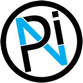
Parts Not Included Logo, 2016-2019
This original logo was created when I first set up the website in the fall of 2016. The design was inspired by the “no” symbol (?) working as the center slant of the ‘N’ (and capitalizing on the “Not” in the site title). You wouldn’t know that by looking at the final version – the bright red of the “no” symbol was too harsh, so I split the ‘N’ from the outer ring and recolored the logo black and pale blue. It’s served its job well, but this original logo has a few issues.
The biggest strike against it is that it’s too busy. There are six separate shapes that make up the logo, all of which are thin and packed closely together. This makes the logo hard to see when it’s small (e.g. as a favicon) and difficult to use as a mark for projects. Plus it stands out like a sore thumb.
Because it’s so busy, it relies on the splash of color in the center to break it up and let it breathe a little. This is why I’ve avoided putting this logo on projects in the past – besides being difficult to make, it flat-out doesn’t look good as a single color. So whether you etch it, paint it, silkscreen it, or cut it out of vinyl – the logo just doesn’t hold up.
Last but not least, the logo tells you absolutely nothing about the site itself. This isn’t strictly a requirement for a good icon, but this old logo may as well be alphabet soup. At a glance, all anyone would be able to tell you about the site is that the letters ‘P’, ‘N’, and ‘I’ are involved somehow. Hardly a glowing endorsement.
This was a good logo for starting out, and it’s served that purpose well. But now it’s time to move on to the next big thing™.
In with the New

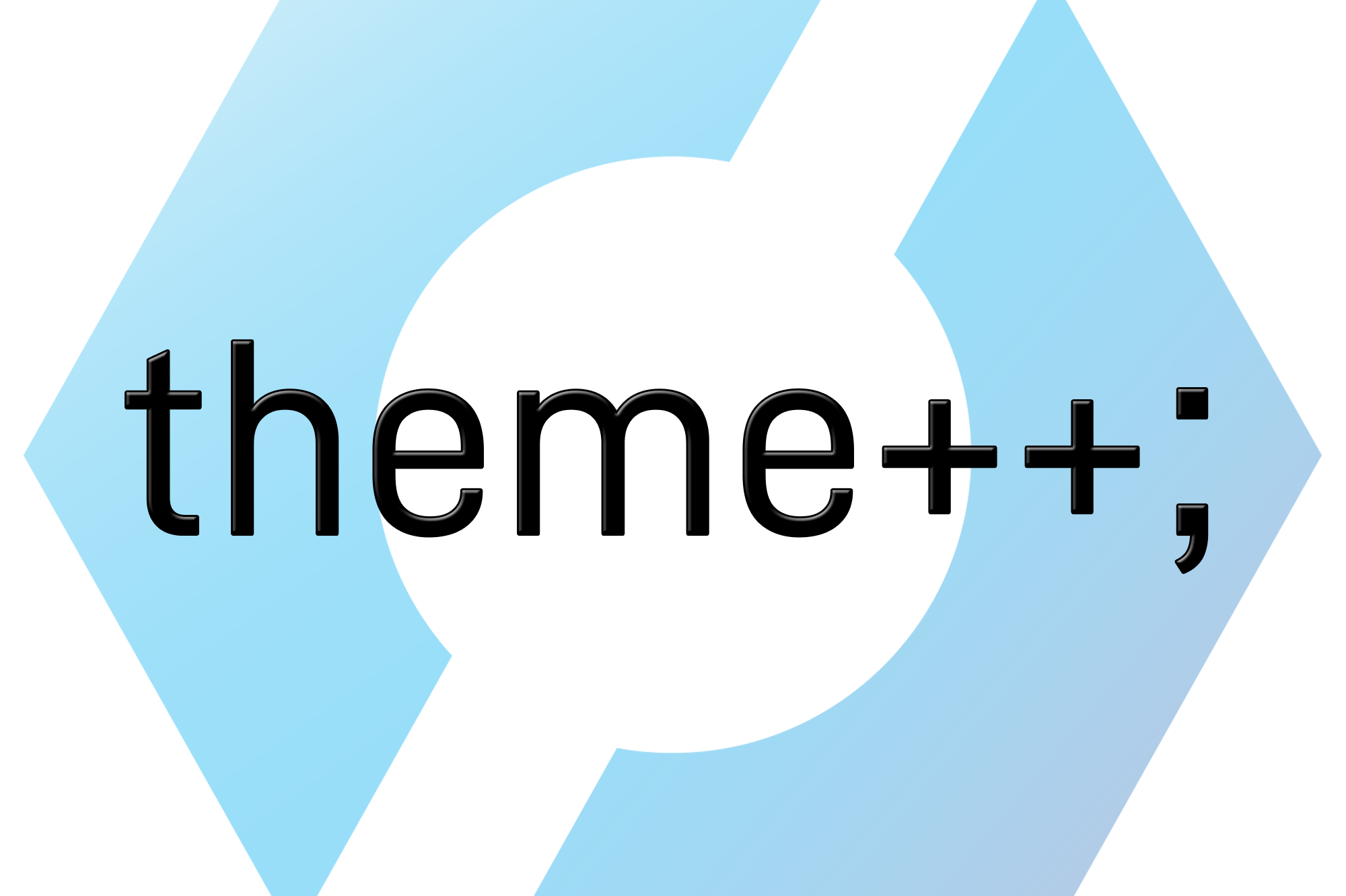
Parts Not Included Logo, 2020
Introducing the site’s brand new logo! This is also based around the “no” symbol, but instead uses the slant as negative space on top of the instantly-recognizable shape of a hex nut. My goal for this new logo was “modern and simple”, and I definitely think this nails the concept.
Compared to the old logo, this new “split nut” design has 1/3rd as many shapes, edges, and anchor points. The simple design, strong outlines, and wide spacing makes the new logo both easy to see at small sizes and easy to recreate physically for projects.
The color of the new logo is based around the same accent color from the original logo, #00adef. To give this a little more depth I added a gradient to try and give the impression of a light source from the top left. But this logo works just as well as a single, solid color, so it will work great for etching, painting, silkscreening, vinyl cutting, and the like.
The site’s title has always been a little amorphous, but I latched onto the word “parts” and drew inspiration from industrial iconography. While the letters from the original logo don’t tell you much of anything about what this site is, I’m hoping the symbol of a hex nut at the very least tells visitors that I build things.

For the site’s header, I’ve also decided to replace the HTML site name and tagline altogether with a nicely preformatted image that combines both the new logo and the site title. The font for this is D-DIN, which I also used for the Aperture Science Dihydrogen Monoxide Containment Unit.
I’ve been playing with this concept in one form or another since last October, and now I’m really excited to finally have this new logo live on the site. I’m really proud of the new design, and this symbol is going to start showing up as a maker’s mark on a lot of my projects from here on out.


