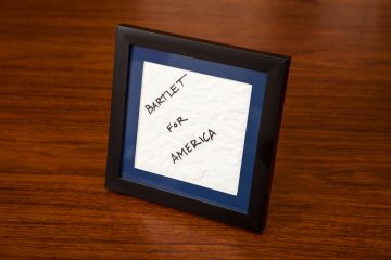
When the story of Harry Potter first took the world by storm in 1997, readers were enamored by J.K. Rowling’s magical universe and the enchanting places within. The ordinary house at 4 Privet Drive in Little Whinging, where “the boy who lived” grew up with his horrible Aunt and Uncle (and their son, Dudley). The Leaky Cauldron, the grubby little pub that serves as the gateway to the fantastical shops and stalls of Diagon Alley. And, of course, the world’s most famous non-existent train platform: Platform Nine and Three-Quarters.
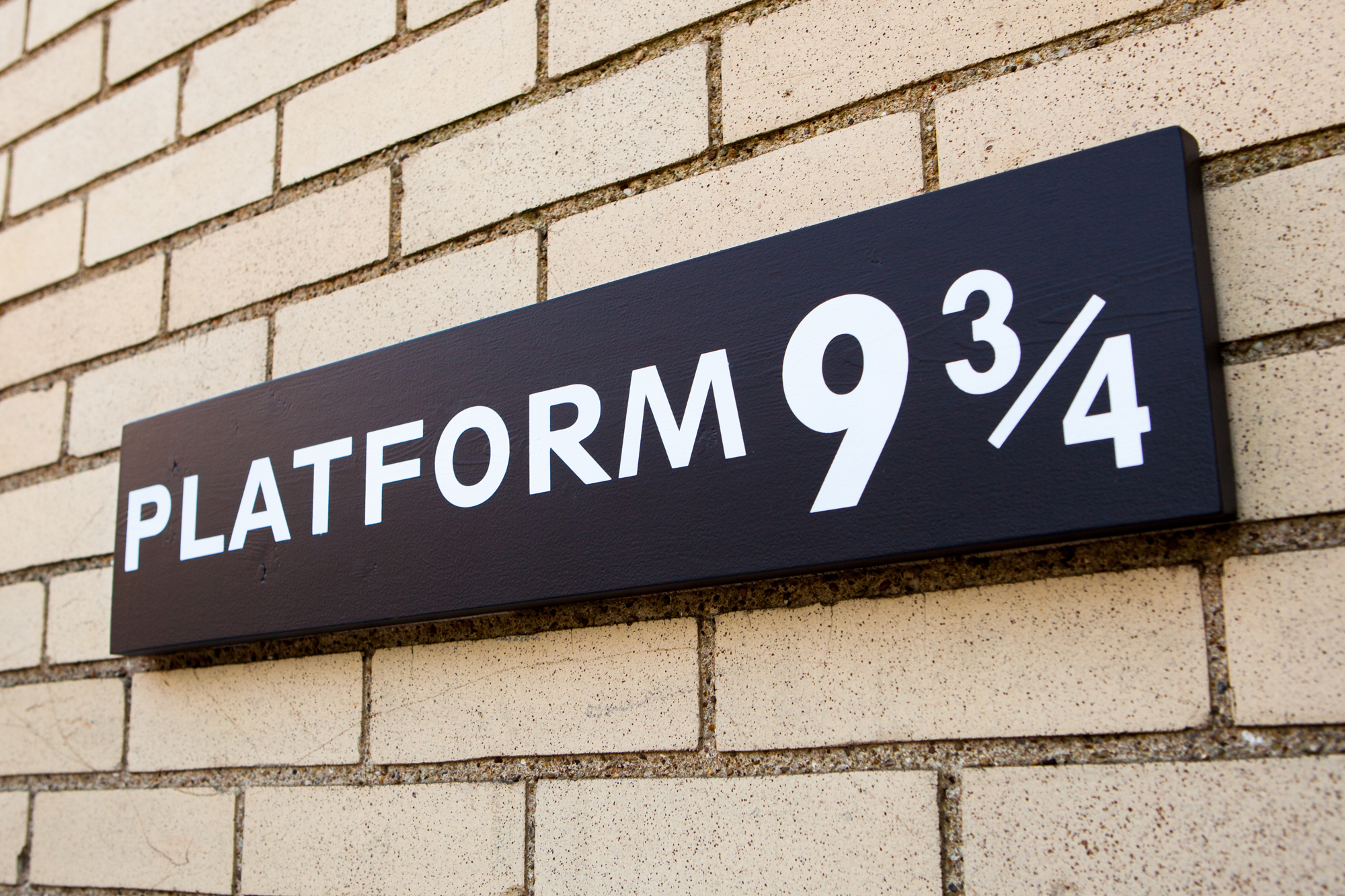
The fictional platform is located in a real muggle-inhabited location – King’s Cross station in northern London. Wizards and witches running at the wall between platforms 9 and 10 would instantly be transported to the mythical platform, where they would say farewell to their families and depart on the scarlet train to Hogwarts School of Witchcraft and Wizardry. Celebrating this connection to the world of Harry Potter, the employees at King’s Cross erected a real-life “Platform 9 ¾” sign in the terminal, which has since become a place of pilgrimage for fans the world ’round.
My sister is one of these many Harry Potter devotees, so this past Christmas I decided to build her her own replica of this iconic sign.
References and Design
As with all good prop replicas, I started with some reference material. The sign at King’s Cross is a tourist attraction, located on a plain brick wall in the main hall and accompanied by a luggage trolley that has been cut in half, appearing to be mid-way through entering the hidden platform.
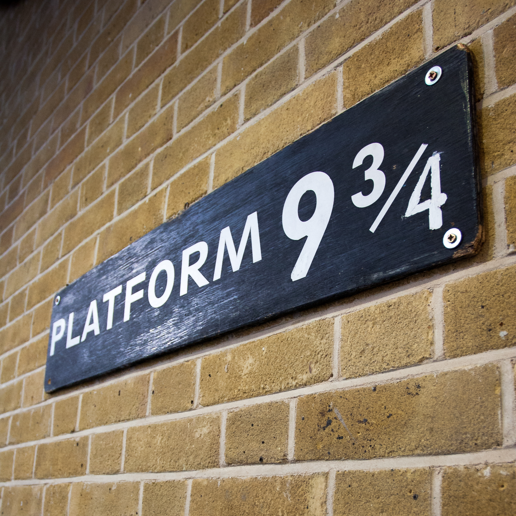
Because it’s a tourist attraction, there are a plethora of pictures online – usually accompanied by fans in wizard garb grinning from ear to ear. I even took a few photos myself when I caught a train out of Kings Cross back in 2012 (above). Although most of these pictures are focused on the excited fans, I was lucky enough to find a handful of high quality ones that were taken straight-on and provide a clear view of the sign which I can use for reference.
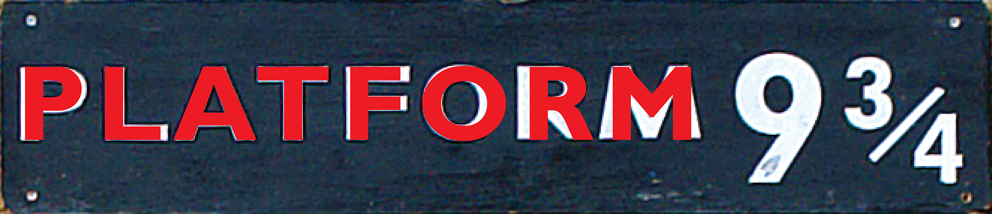
The best reference photo I could find was this one by Pete Shacky on Flickr, circa 2007. It’s good quality, high resolution, straight-on, and it was taken when the sign was first installed and in good condition. Yes!
Best that I can tell, the sign is a piece of plywood painted black with the lettering “Platform 9 ¾” in white vinyl. You can tell that it’s vinyl because in my 2012 photos some of the edges have curled up, and the ‘4’ must have come off because it’s been repainted rather hastily. The concept seems simple enough – let’s get to work!
Aspect Ratio
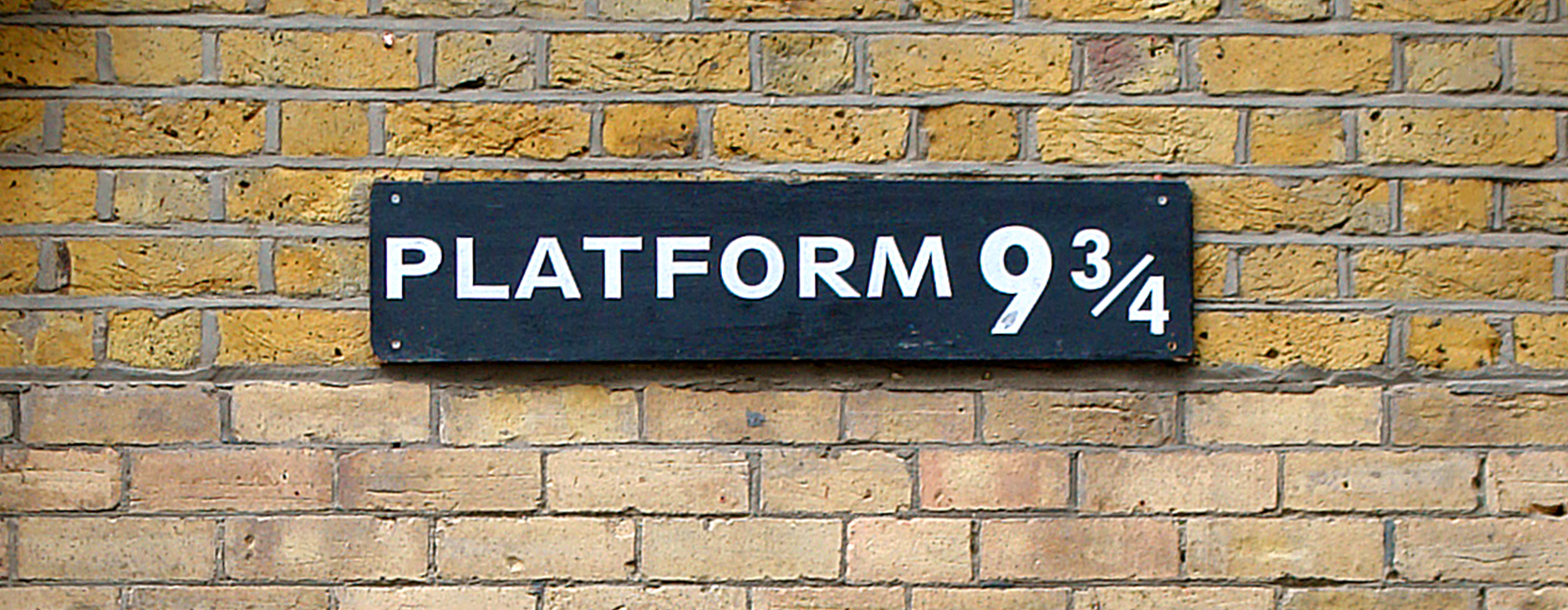
Pete’s photo was taken ever-so-slightly off kilter, so in Photoshop I rotated it 0.5° to the left to make the sign level and then cropped as close as I could to the sign itself. Comparing the number of pixels on each side of the cropped image gave me an aspect ratio of approximately 4.625 : 1 (width to height). Regardless of what size I choose to make the sign, if I keep this aspect ratio between the two sides it should look the part.
Dimensions
Speaking of sizing… unfortunately the only size reference near the sign itself are the bricks. I found a source that says bricks in the UK nowadays are typically 215 x 102.5 x 65 mm (L x W x H) with a 10 mm thick mortar joint. But seeing as Kings Cross Station was built in the middle of the 19th century and the metric system wasn’t adopted until 1965… this is going to be a tenuous guess at best.
There are two bricks types on the wall: pale, tan bricks down below with a thin mortar joint and more porous, yellower bricks up higher with a thick mortar joint. At the native resolution of our reference image, the tan bricks are approximately 49 pixels tall (~1.33 px/mm) and the yellow bricks are approximately 45 pixels tall (~1.44 px/mm). The sign as-cropped is 143 pixels tall, which along with the 4.625 : 1 aspect ratio above gives us our (rough!) measurements:
- Tan Bricks @ 65 mm: 877.3 x 189.7 mm (34.5 x 7.47″)
- Yellow Bricks @ 65 mm: 955.3 x 206.6 mm (37.6″ x 8.13″)
Using imperial measurements because I’m a bloody yank, I would probably shoot the average and say the sign is about 36″ wide and 7 ¾” tall. This is all assuming that the bricks are in fact in the ballpark of 65 mm and ignoring other effects such as perspective and lens distortion (spherical cows and all that). But a 3 foot long sign sounds about right.
Lettering and Typography

Okay, here’s where the rubber meets the road. I have a good handle on the size of the sign, but what the heck is that typeface / font they used for the letters? It’s clearly some sort of modern sans-serif typeface, but I’m not sure exactly what.
After trawling through dozens of sans-serif block fonts, I still could not find a perfect match. I even tried asking the folks who run the Platform 9 ¾ shop but didn’t get any response. The two closest fonts I could find were Gill Sans MT Bold and Twentieth Century MT Bold. Neither of these fonts is an exact match, but with a little bit of tweaking I can create something that is close enough to be indistinguishable.
Gill Sans
Gill Sans was an obvious contender from the start due to its close relationship to Johnston Sans – the official typeface for London public transport since 1933 (and tragically not available publicly). Thankfully its counterpart Gill Sans is readily available, and comes with my installation of the Adobe Creative Suite.
After setting the character height to around 3.9″ and modifying the tracking to 100, the bold version of the font is almost a perfect fit for both the ‘A’ and ‘T’ characters. It’s not an exact fit though… the ‘P’, ‘L’, and ‘F’ will need to be stretched out a bit, the ‘O’ will need to be stretched in, and the font is completely wrong for the ‘R’ and ‘M’. But we can work around that.
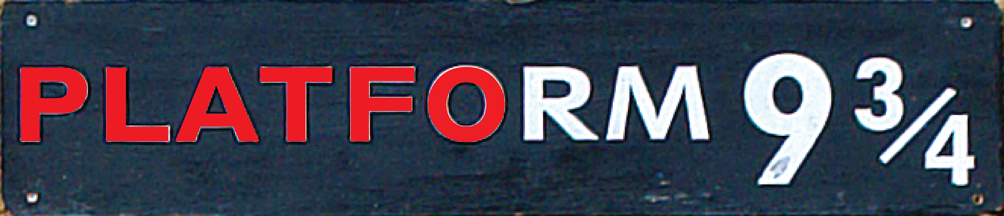
In illustrator, I converted the ‘P’, ‘L’, and ‘F’ into vector outlines and adjusted the anchor points until they more closely aligned with the reference image. For the ‘O’, I resized the character’s width until it fit within the reference letter, then selected the inside loop and stretched it out until it matched the shape of the reference. Now we’re getting somewhere!
Twentieth Century
The other font is Twentieth Century, which was one of the sans serif fonts already installed on my system when I first started shopping for matching typefaces. Twentieth Century was created in 1937 as a competitor to Futura, and although the bold versions are quite similar, Twentieth Century seemed like a better fit. The key here was the ‘M’ character, which unlike Gill Sans and many other sans-serif typefaces has slanted sides and a center stroke that descends all the way to the baseline.
I expanded the bold font to 120% of its original width and adjusted the tracking to 40. As with Gill Sans, this has some promise but it’s definitely not an exact fit. Thankfully the ‘R’ and ‘M’ are much closer to the reference.
Before modifying these letters, I created two guides that aligned with the top and bottom of the existing Gill Sans characters, just to be sure that the two fonts lined up in the end. After converting the ‘R’ and ‘M’ characters to outlines, I resized them to align with the guides and then tweaked the x-height on the ‘R’, modified the angle of the ‘R’s leg, and widened the center portion of the ‘M’.
9 ¾
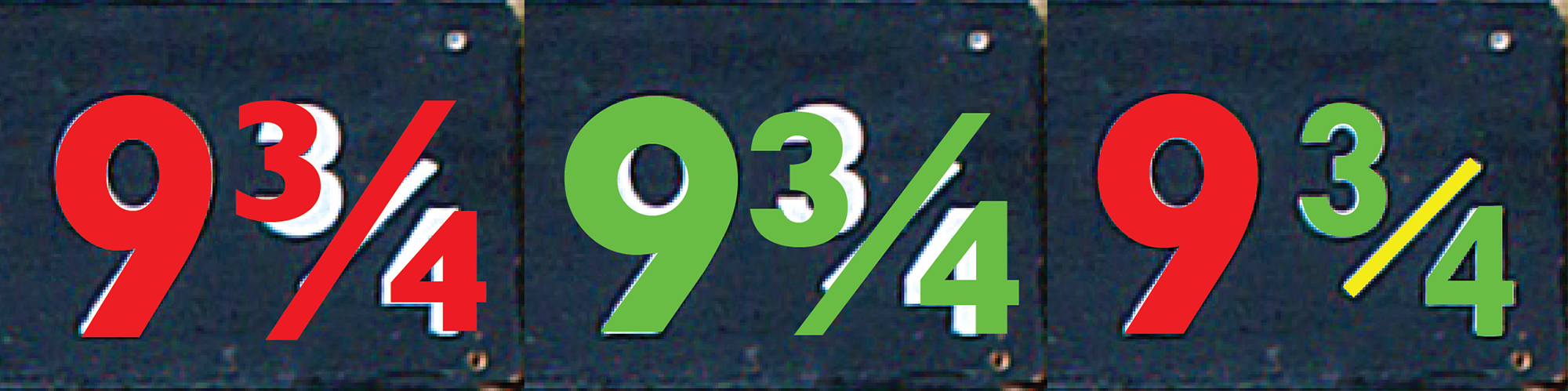
Thankfully the numbered portion of the sign was more straight-forward.
The “9” is Gill Sans, stretched slightly to align with the reference image. Other than this stretch, the anchor points for the ‘9’ are unmodified.
The fractional numbers were arranged by hand from their component parts. Both Gill Sans and Twentieth Century have a character for the unicode “¾”, but the divisor bar has slanted ends and doesn’t align with the reference image for either font. So instead I created the fraction by hand with the ‘3’ and ‘4’ characters and a rectangle. The ‘3’ in Gill Sans is much different than the Kings Cross sign, but the ‘3’ from Twentieth Century was a dead ringer so I decided to use Twentieth Century for both numbers in the fraction.
Building the Sign
Now I have some solid references, the dimensions, and a (reasonably) accurate digital version of the sign in vector format. Let’s make the thing!
Prepping the Plank
The board for this project is an inexpensive 1 x 6 x 72″ pine board, purchased from my local Home Depot. Since this is going to be painted over and kept inside, there was no reason to go all-out with fancy lumber – pine works just fine.
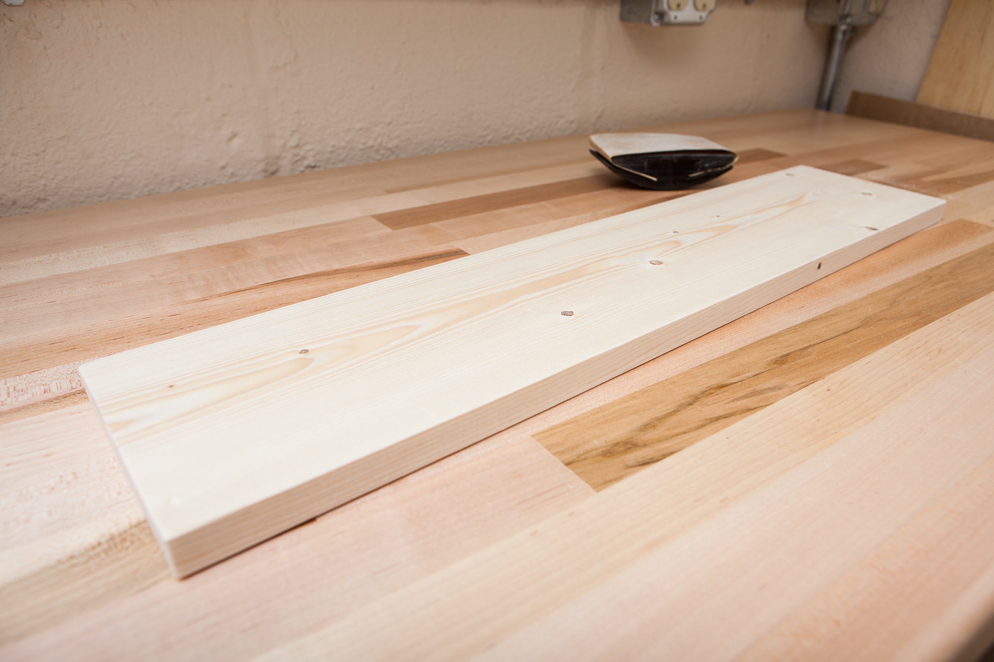
This is going to be a little smaller than the real sign. Although I ballparked the King’s Cross sign at around 36″ long, that seemed a bit large for a bedroom prop so I’m downsizing things a bit. To simplify, I’m going to keep the height of the board and just cut it to length. For this 1 x 6″ board the height is a little less than 5 ½”, which makes the length about 25 ¼”.
I marked and cut the board to length using a circular saw, then lightly sanded everything with some 150 grit sandpaper on a sanding block in order to smooth the edges and knock off any burrs . There are a few dents and dings on the surface, but I decided not to fill those in order to give the sign a little extra depth. Time for paint!
Painting the Base Coat
After covering my work surface with all the protective cover that’s fit to print, I flipped the board over and marked 1″ in from each edge. Then I applied 1″ painter’s tape to cover up the center of the board and leave a nice unpainted area to later write the date and a nice gift message.
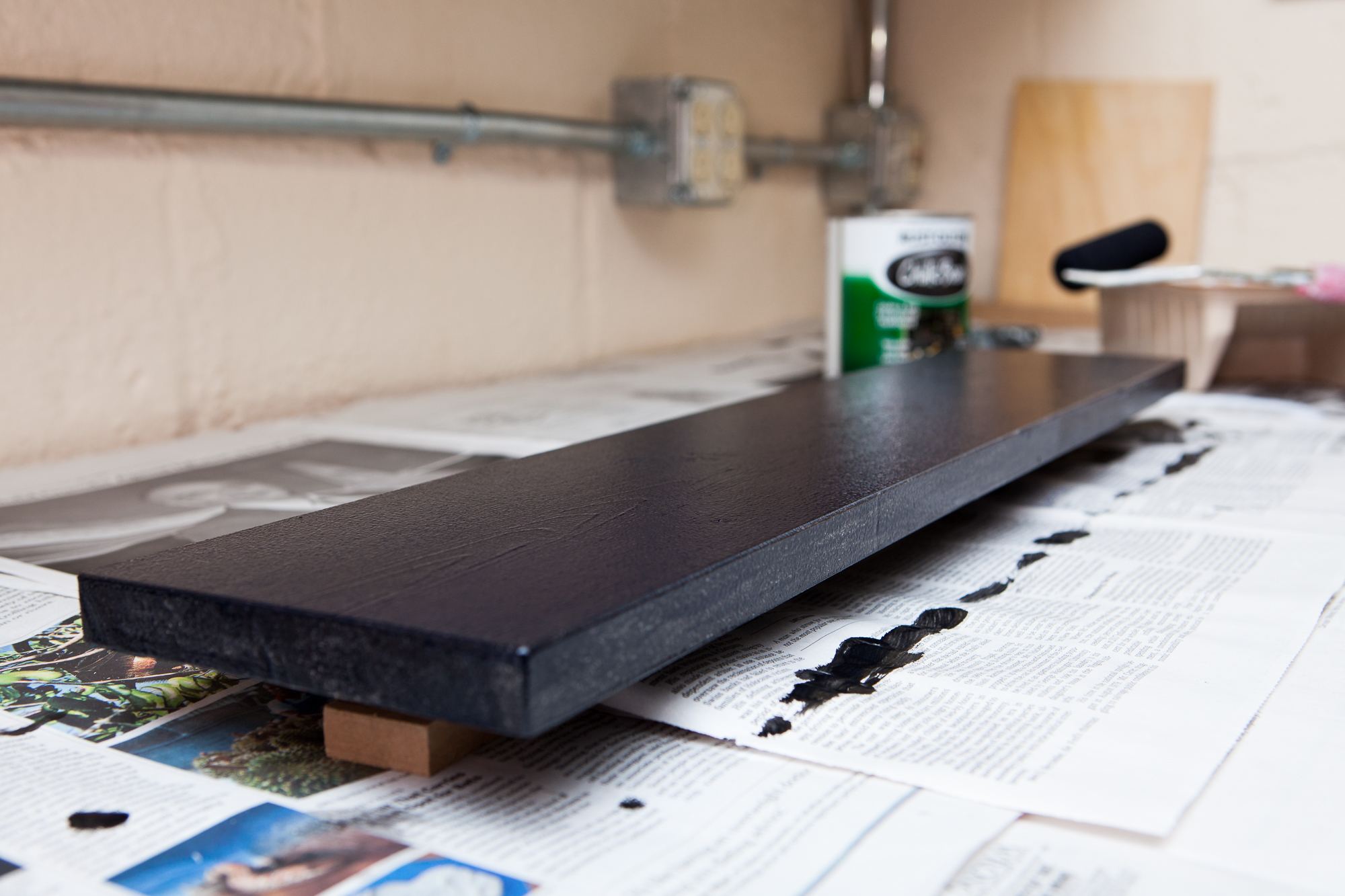
Then I broke out the paint. To prime the board I’m using Sherwin-Williams multi-purpose latex primer, which I had left over after painting some rooms. I mixed up the primer in the can, poured it into a roller tray, and rolled it onto the board with some 100 mm mini foam rollers. So I could paint both sides in one coat, I first painted the back and then stuck some stacked ½” MDF blocks underneath the taped section when I flipped it over.
After letting the primer dry for a few hours and lightly sanding it smooth with 500 grit sandpaper, I started in with the base coat. For the black color I’m using Rust-Oleum chalkboard paint. I had some leftover from another project and I thought the semi-gloss sheen would work nicely. I applied 2 light coats with the roller, sanding with 500 grit sandpaper between them.
Cutting the Stencil
At this point this “Platform 9 ¾” sign is just a black piece of wood. Time to add the lettering and make it pop!
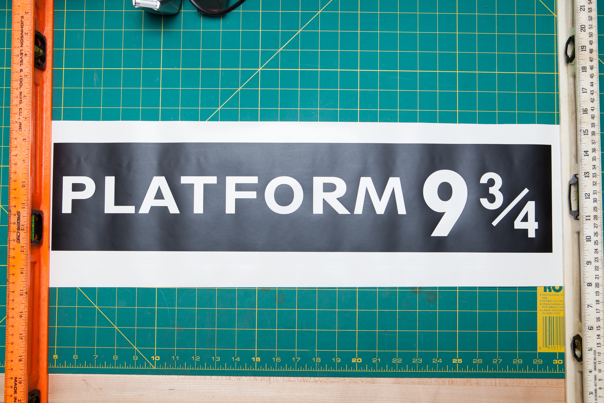
Although the original sign just used white vinyl lettering, I wanted my version to be a tad bit more detailed and permanent. Instead, I’m going to use the digital design of the sign I created earlier to cut a vinyl stencil for spray painting.
I set up my Silhouette Cameo 3 on my workbench and loaded in the vinyl. I’m using a 12″ wide roll of matte black Oracal removable 631 adhesive vinyl which I had leftover from the DJ Hero Lucio project. A different color of vinyl with more contrast against the black paint would have been easier to see while working, but as this is just a stencil the black vinyl works just fine.
Since this is a long cut, I set the right roller on the machine to the 8″ position and then set the left edge of the vinyl an extra inch outside of the alignment mark. I did my best to load the vinyl straight, but just in-case it becomes misaligned during the cut this gives me some extra margin for error on either side. After pressing the ‘Send’ button, it took only a minute to cut out the entire sign.
I moved the roll to my cutting mat, trimmed off the uncut vinyl, and then weeded the letters to leave only the stencil remaining. Then I cut and applied some transfer paper, using a plastic putty knife and a plastic razor blade to remove bubbles and secure the vinyl to the transfer sheet.
Applying the Stencil
After adhering the vinyl to the transfer paper it was time to apply the stencil to the board. I had originally intended to start with the long edge of the vinyl first in order to keep everything aligned, but the backing paper was too stiff to curl on top of the board while leaving the vinyl attached. Instead, I started on the left-hand side (“P”) and worked my way right.
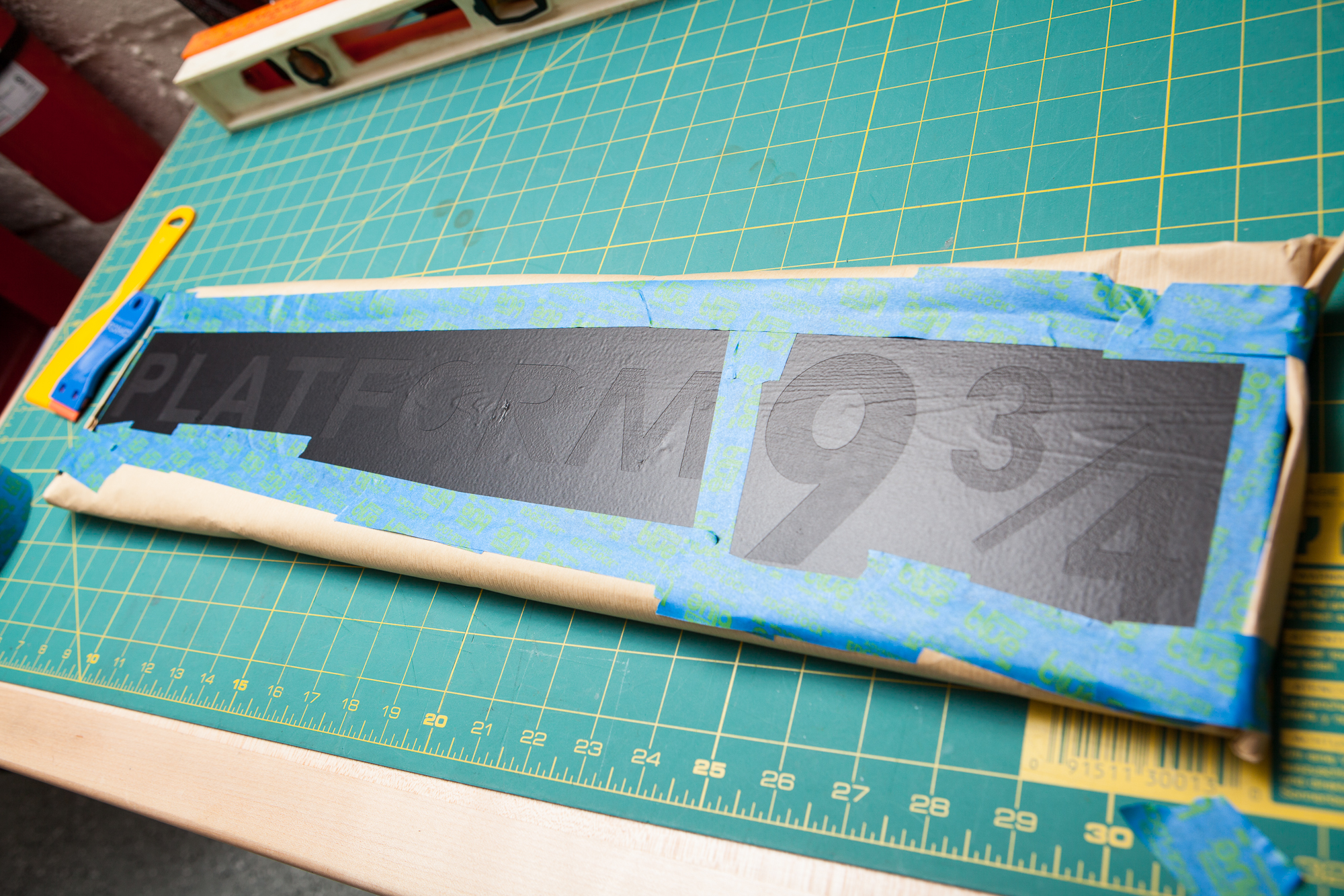
This did not go as smoothly as I had hoped. I applied the start of the stencil ever-so-slightly askew, and every 6 or 7 inches had to nudge the vinyl to keep it straight. Halfway through the application I cut off the “9 ¾” portion and applied that separately from the right, just to make things simpler. The result of this “nudging” was a handful of small creases near the edges of the letters, but since this is just a stencil I wasn’t too concerned. The only real problem area was the tiny sliver of vinyl between the ‘L’ and the ‘A’, which I carefully cut out and replaced with some hand-cut vinyl from the discarded letters.
With the stencil applied to the board, I then sealed the seams with painter’s tape and wrapped the back of the board in a layer of brown craft paper. Time for paint!
Painting the Letters

This part was easy. After brushing away any dust on the clear area of the stencil, I laid down some newspaper on the floor of my garage, placed the sign on top, and gave it a quick light layer of flat white spray paint. I applied three light coats 30 minutes apart each, then after one hour I removed the paper cover and peeled off the vinyl stencil.
The letters came out beautifully. Due to the wrinkles in the stencil there are a handful of places where the paint bled over a tiny bit, but nothing disastrous. After 24 hours, I pulled off the strips of painter’s tape on the back that were covering the wood for the mounting hooks, then applied a flat clear coat over the whole thing. Like with the lettering, this was left to cure for another 24 hours.
Once the clear coat had cured, I installed two mounting hooks on the back and wrote a brief gift message with a felt-tipped marker. Done!
Conclusion – Sign: Sealed, Delivered
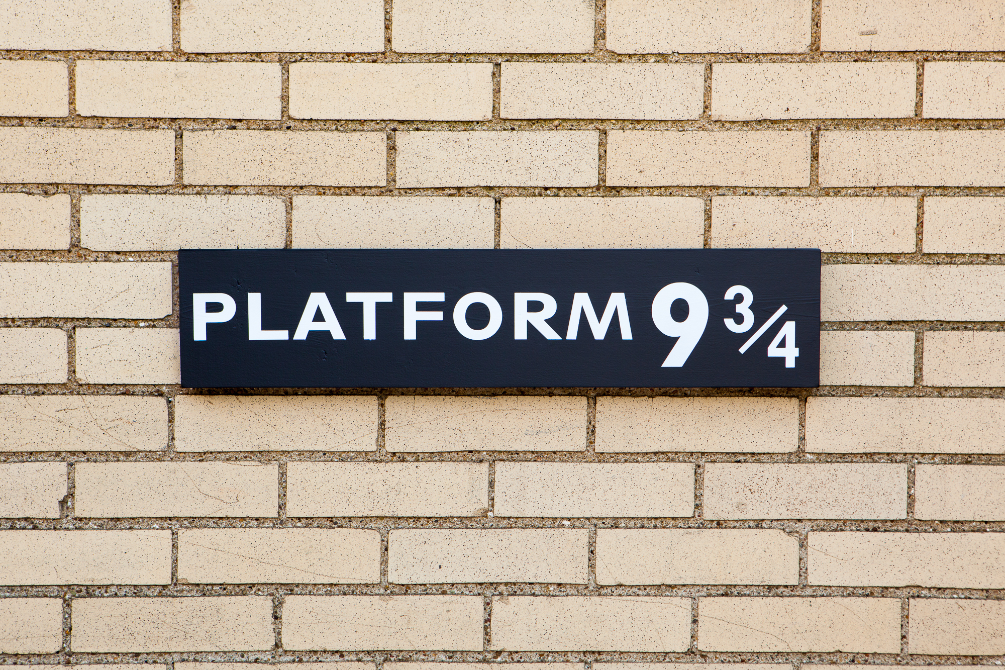
Mischief managed! The finished sign looks great and I’m really happy with how it turned out. These photos were taken in front of a yellow brick building nearby, and if I didn’t know any better I could have easily confused this sign with the one at King’s Cross.
This was my sister’s Christmas present last year (2019). And she thought it turned out great as well:
Parts List
I’ve linked supplies throughout the post as they’re used. But because it’s often useful to have these all in one place, here’s a comprehensive list.
Please note that some of these are Amazon affiliate links which help fund the content on this site. Thank you for your support!
Supplies:
- 1 x 6 x 72″ Pine Board
- Sherwin-Williams Multi-Purpose Latex Primer
- Rust-Oleum Chalkboard Paint
- Oracal Removable 631 Adhesive Vinyl (Matte Black)
- Vinyl Transfer Paper
- Rust-Oleum Painter’s Touch Multi-Purpose Spray Paint (Flat White)
- Krylon ColorMaster Acrylic Crystal Clear, Flat