Three years ago in April of 2018, maker and YouTuber Simone Giertz gave her own Ted Talk. It was titled “Why You Should Make Useless Things”, and it was about Simone’s own journey growing up while struggling with performance anxiety and perfectionism. She eventually found an outlet for those issues (and a career!) through building what she affectionately calls “shitty robots”.
I’ve struggled for a long time with my own perfectionism (as evidenced by just about everything on this website), and her talk truly resonated with me. I was and still am inspired by her playfulness in approaching projects, and I try to inject some of that energy and excitement into my own work – though I don’t always succeed.
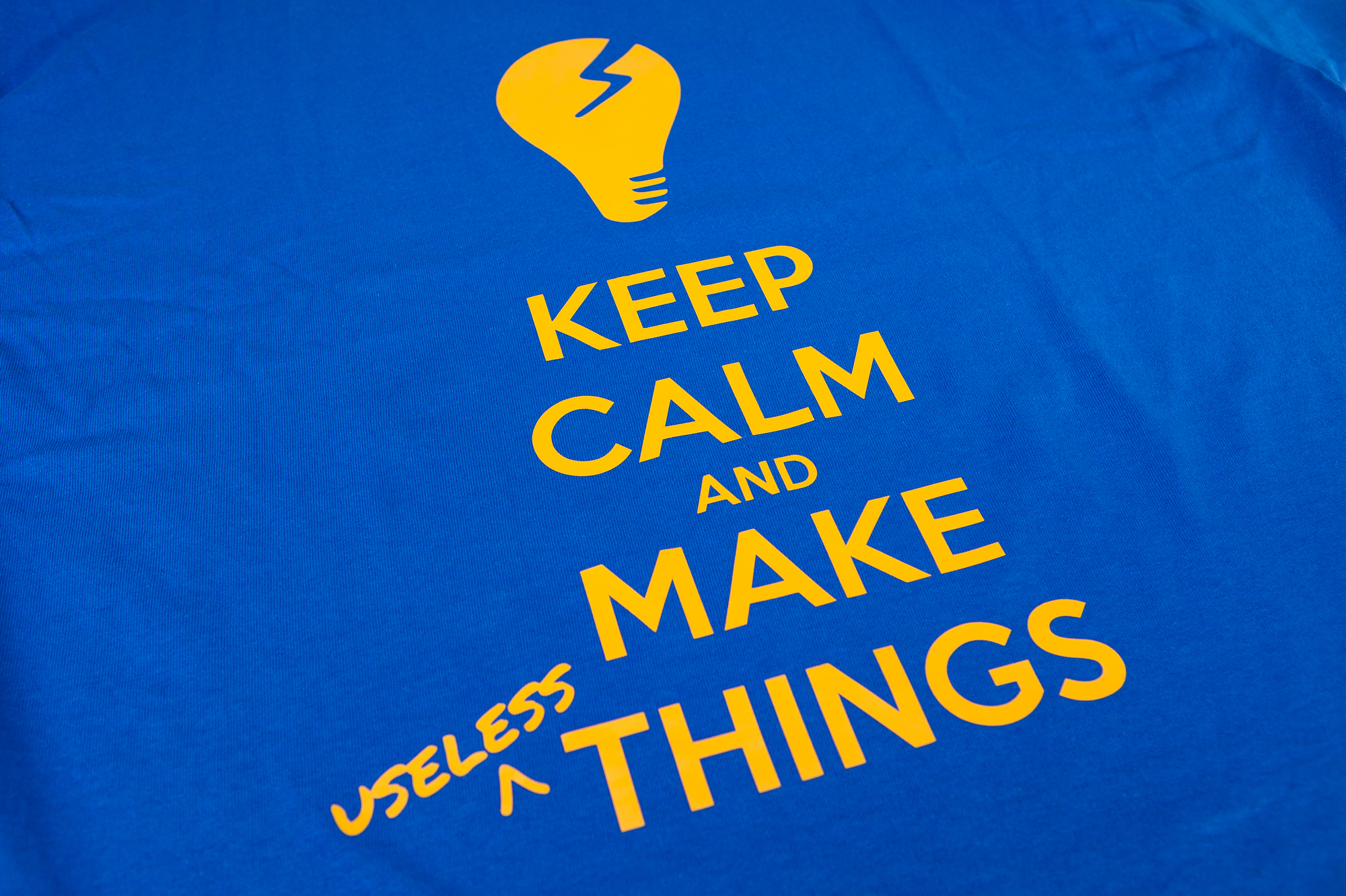
To that end I thought I’d immortalize her words into some DIY art, by making a T-shirt with the phrase: “Keep Calm and Make Useless Things”.
Some Background
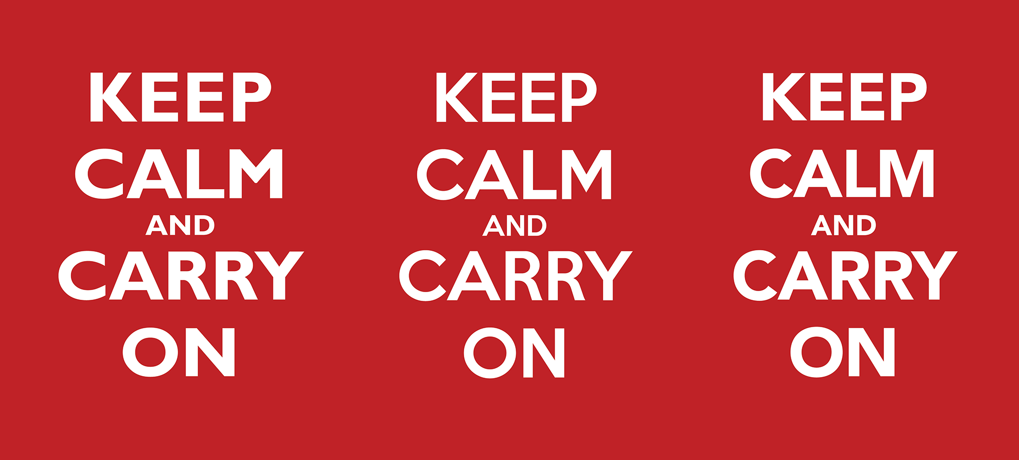
This is a play on the famous “Keep Calm and Carry On” poster, a motivational poster produced by the British government in preparation for World War II. To quote Wikipedia:
The poster was intended to raise the morale of the British public, threatened with widely predicted mass air attacks on major cities. Although 2.45 million copies were printed, and the Blitz did in fact take place, the poster was only rarely publicly displayed and was little known until a copy was rediscovered in 2000 at Barter Books, a bookshop in Alnwick. It has since been re-issued by a number of private companies, and has been used as the decorative theme for a range of products.
Evocative of the Victorian belief in British stoicism – the “stiff upper lip”, self-discipline, fortitude, and remaining calm in adversity – the poster has become recognised around the world.
https://en.wikipedia.org/wiki/Keep_Calm_and_Carry_On
Nowadays there are thousands of derivative and parody designs that transform the original poster into something new. Today I’m joining that group with my own (playful) version, which is hopefully less trite than the common “keep calm and drink more” designs.
Creating the Design
There are two parts to the design: the icon at the top, and the typography for the text.
Lightbulb Moment
In the original version there is an image of the monarch’s crown above the text. While that could still work here (👑💩🤖), I have a better idea. Simone has her own logo – a cracked lightbulb with her name it in a circular frame. I just need to find a high quality version of it.
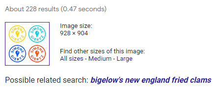
There are small-ish versions of her logo at the end of every YouTube video (~1100 px), and as the favicon of her website (375 px). Google’s reverse image search found no higher quality versions of the logo but did think it was the logo to Bigelow’s New England Fried Crabs (seriously). So… that’s neat.
Eventually I lucked out. Her merchandise store has a small version of the logo in the title bar which is in fact linked to a super large PNG image (4800 px). Score!
After importing the image into Adobe Illustrator, I isolated the lightbulb and converted the outlines to vectors. Then I cleaned up some of the edges so they’ll cut more smoothly on the vinyl cutter, and resized it so that it’s roughly the same size as the crown (rotated by 90°).
Typography
The typography was a little trickier. Thankfully I’m not the first one to make a variation of this poster, so I can rely on some pre-existing research.
I found this blog post which claims that the typeface is Caslon Egyptian (1816), the first commercially available sans-serif typeface. At the time that blog post was written a digital version of Caslon Egyptian was unavailable, but it appears that that it can now be purchased from TypeNetwork… at a price.
The blog post also identifies a lot of the fonts people have used over the years to create their own derivative posters: Avenir and Gill Sans are the top contenders, although apparently people have used other sans-serif typefaces such as Arial, Century Gothic, and Verdana as well (with varying degrees of success).
I was originally going to use Gill Sans for this, which I used previously in other projects with success and is conveniently installed alongside the Adobe Creative suite. But after looking at the result side-by-side with the original it’s close but not close enough. The multiple radius curve of the ‘C’ is a dead giveaway, and the rest of the text is either too skinny (Medium) or too thick (Bold). (And now that I notice it, it’s hard to unsee the shape of the ‘C’ on most other derivative merch!)
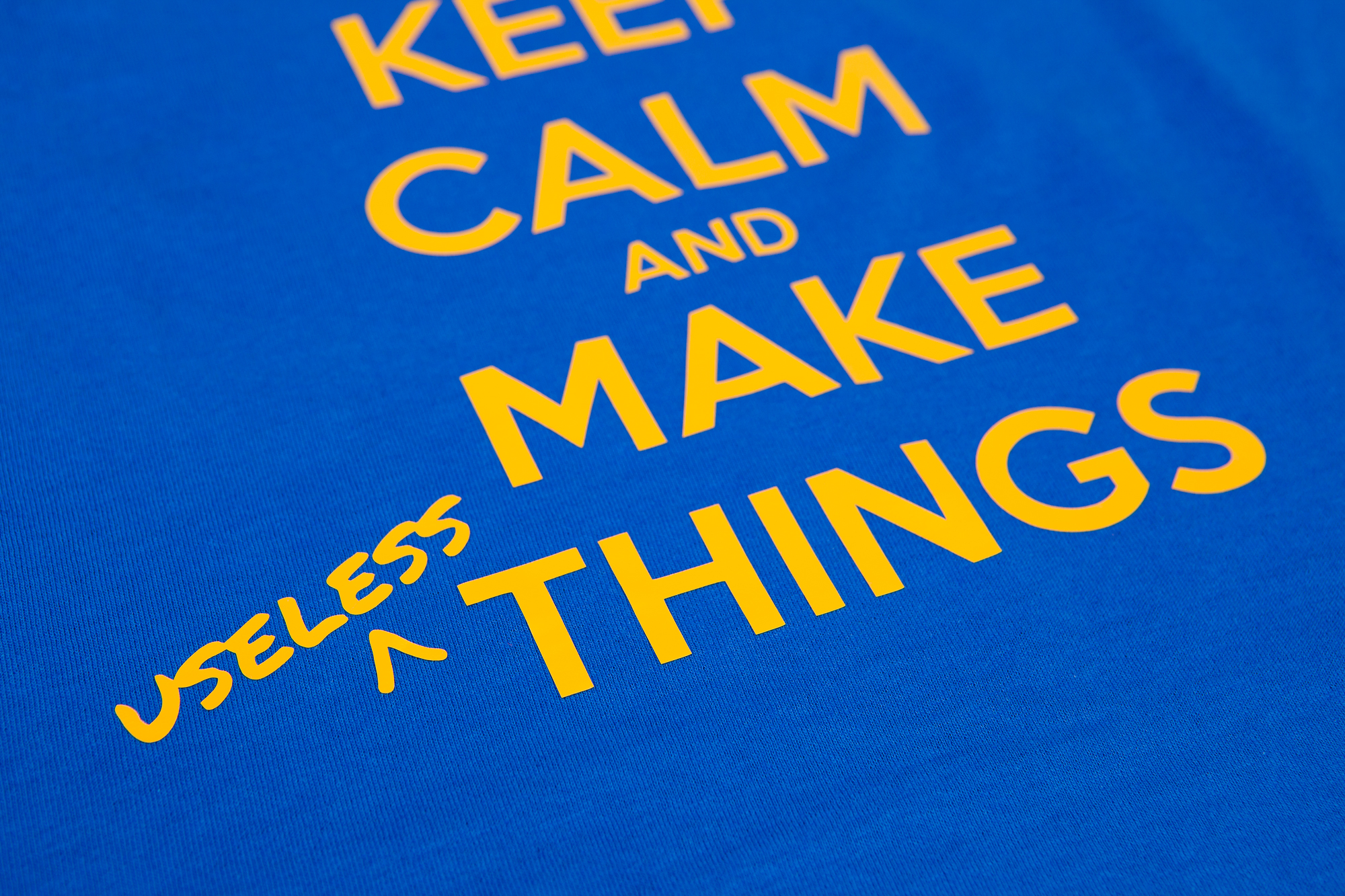
Eventually I found a font that was created from the poster called (predictably) “Keep Calm”. To my untrained eye it’s a dead ringer, and more importantly it’s free for personal use!
Out of (Word) Order
One point of contention is the arrangement of words. The original poster is nicely symmetric: “KEEP CALM / CARRY ON”. It also has a good rhythm to it – two syllables in, a break, and three syllables out. This version is going to be asymmetric, with three words and four syllables in the latter half.
While I was working on this I had this nagging feeling that something was off. The bottom of the design had too much weight, and more importantly it felt… wrong.
The sentiment is supposed to be a bit rebellious. It’s a statement against utility, against perfectionism, against straight lines and perfectly spaced content. And yet that was exactly what I was creating – a propaganda poster in the exact opposite style.
And then I had an idea that miraculously transformed the whole thing. To take the modifier, “useless”, and extract it from the rest of the text as a piece of minor graffiti! I made a hand-drawn caret and found a great font to go with it. (By pure chance this is also the font Simone uses for her name on her website. Funny how these things work out.) I feel like the result speaks for itself.
This also adds another message underneath the original: keep calm and make things (useless or not).
T-Shirt Making
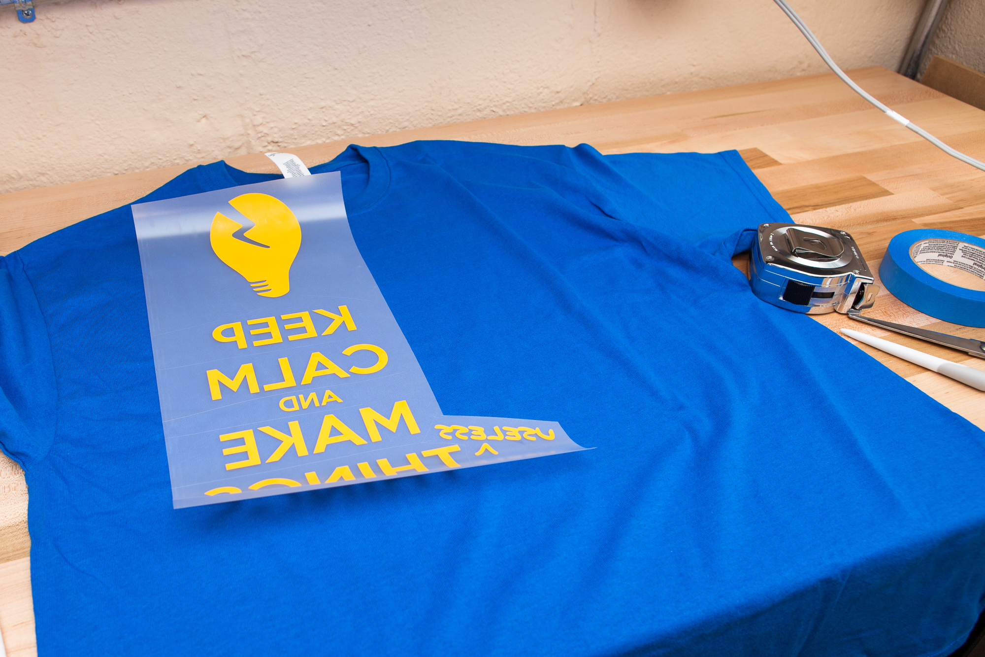
For the shirts I bought some inexpensive Gildan cotton t-shirts in royal blue (XL). These are going to be paired with yellow heat transfer vinyl for the graphics. Although I thought about silkscreening again, I figured that the sharp lines and solid colors of the vinyl would better serve the character of the design.
I sized the design by eye (~14 x 9″), then mirrored the graphics and cut the vinyl out on my Silhouette Cameo 3. After weeding I placed the design on the shirt, added an old t-shirt underneath for heat protection, then ironed each group of text with a household iron for around 15 seconds to adhere the vinyl.
This was my first time working with heat transfer vinyl and I had a little bit of trouble getting the smaller bits (“useless”, and the threads on the lightbulb) to stick to the shirt. For the vinyl I’m using I think I need to pull the carrier sheet off when it’s a little hotter rather than waiting until everything has fully cooled. A little more experimentation is required to know for sure, but for the time-being I just gave those bits a second dose of the iron and all seems well.
For a time I also considered adding a copy of Simone’s logo on the back of the shirt behind the neck, although I eventually decided that the extra weight and tension of the vinyl may not feel great after wearing the shirt for an extended period of time. Better to let the design speak for itself.
And Carry On
The true beauty of making useless things [is] this acknowledgment that you don’t always know what the best answer is. And It turns off that voice in your head that tells you that you know exactly how the world works. Maybe a toothbrush helmet isn’t the answer, but at least you’re asking the question.
Simone Giertz, TED2018
And that’s a wrap! I’m biased but I absolutely love how the shirt turned out. It has just the right mix of inspiration and playfulness that’s at the soul of most of Simone’s work. The vinyl heat transfer worked great and I can’t wait to start wearing this in and around the shop.
Because this uses Simone’s logo and brand I wouldn’t ever dream of selling these. If you don’t already, go subscribe to Simone on YouTube. You can also find her (official!) merch on her website, along with links to her other social media accounts.
Ok byeeeeee!
Parts List
This was a pretty straightforward project but I always like to collect a list of parts for those looking to make something similar. In case you want your own shirt, here are the supplies and tools I used.
These are Amazon affiliate links which help fund the content on this site. Thank you for your support!
- Gildan Royal Blue Cotton T-Shirts, XL
- HTV Heat Transfer Vinyl, Yellow (~2 ft)
- Silhouette Cameo 3 Vinyl Cutter
I also used a typical household clothes iron for the vinyl transfer, set to ~300° F.